Personal website of Art Blanc

Blog

This is where I write for the web.

Posts tagged redesign
Fly Birdie


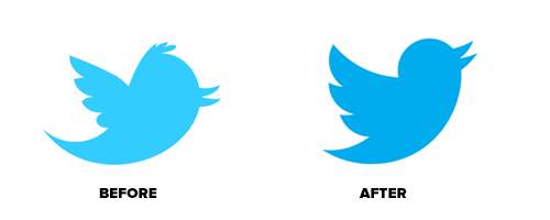
  Starting today you’ll begin to notice a simplified Twitter bird. From now on, this bird will be the universally recognizable symbol of Twitter. (Twitter is the bird, the bird is Twitter.) There’s no longer a need for text, bubbled typ…

Fly Birdie

Starting today you’ll begin to notice a simplified Twitter bird. From now on, this bird will be the universally recognizable symbol of Twitter. (Twitter is the bird, the bird is Twitter.) There’s no longer a need for text, bubbled typefaces, or a lowercase “t” to represent Twitter.

I like this new logo of Twitter, take-off and fly!

(via Dustin Curtis)

Over at Everything Type Company:

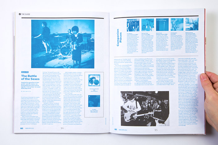
The magazine grew in size, is now printed on better stocks, and circulates less frequently. We drew on the rich heritage of ’80s/’90s SPIN, a no-nonsense, bold, and considered approach to music journalism.

Great concept and execution.

It’s a window… not a flag


Windows 8 logo redesign or in Microsoft’s own word; Reimagined. It’s obviously taking the logo-mark from the metro tiles when being scroll horizontally, kinda in perspective. The identity is also color-agnostic, so it …

It’s a window… not a flag

Windows 8 logo redesign or in Microsoft’s own word; Reimagined. It’s obviously taking the logo-mark from the metro tiles when being scroll horizontally, kinda in perspective. The identity is also color-agnostic, so it changes with the color scheme being used in the start screen. I still don’t get it why they still use the name “Windows”, why not use “Metro” instead.

Art Blancwindows 8, identity, redesign