Ryan Greenberg on Twitter’s new brand guideline:
People, the rules are very clear: Don’t change the logo to look like Batman.

This is where I write for the web.
Ryan Greenberg on Twitter’s new brand guideline:
People, the rules are very clear: Don’t change the logo to look like Batman.
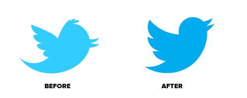
Starting today you’ll begin to notice a simplified Twitter bird. From now on, this bird will be the universally recognizable symbol of Twitter. (Twitter is the bird, the bird is Twitter.) There’s no longer a need for text, bubbled typefaces, or a lowercase “t” to represent Twitter.
I like this new logo of Twitter, take-off and fly!
(via Dustin Curtis)
It takes well over a year to design, execute, deliver, and ensure the proper implementation of the roughly 5,000 or so assets it takes to get a CS release out the door (we’re already thinking about CS7). Along the away, there are innumerable institutional, technological, and political hurdles to overcome. It can be daunting, but we do everything we can to get it made with as few design compromises as possible.
Adobe explains the design process and thinking of their new CS6 branding. For me the Indesign’s splash screen is atrocious, it’s like some drawing errors. Why can’t Adobe settle with something like CS3–CS4 splash screen, it’s elegant and easy on the eyes. These applications are already complex as they were, why further complicate the apps start-up experience with these splash screens? Also please put inner-shadow on Illustrator CS7, thanks beforehand Adobe.
(via Shawn Blanc)

Established in 1912 the National Association of Swedish Handicraft Societies (SHR) celebrates its 100th anniversary in 2012. I love their idea behind this, which is: “Everything SHR say, we say by hand.” I don’t want to waste your time reading my opinion on this, it’s great. Check the rest of it here, and look at their process, seems very fun. SNASK have an amazing portfolio make sure you look around their site too.
(via The Fox is Black)
After reading this piece by Shadoe Huard, he pointed out a post by Juan Perez over at The Verge’s Microsoft Tribe forum:
There haven’t been a better moment for Microsoft to start integrating products, services, design and philosophies than right now. With Windows 8, a lot of stuff will become part of each other as the software will not only be tied by the Metro UI, but the functionality: seamless integration of services like SkyDrive, Messenger, Skype, and others, will make people realize the potential of the Microsoft ecosystem.
So what better way to represent and showcase this integration than rethinking it into a cohesive, easy to understand, modern, and ultimately Metro, experience? It’s not just about the Windows 8 logo, but all the services that will be part of it.
It’s virtually obvious for Microsoft to use this strategy and yet they pick a rather peculiar notion. Maybe the Redmond-bunch have been thinking to overhaul all the branding to realign it with the Windows 8 as the new branding cornerstone. If not, well, it’s truly will be a missed opportunity. Anyway, check Perez’s integrated branding mock-up he proposed for Microsoft, I personally love the idea.