Personal website of Art Blanc

Blog

This is where I write for the web.

Posts tagged typography
Beyond Helvetica
… Developers can now drop long-form texts into reader-friendly, attractive layouts, with multiple columns and with image layers that aren’t chained to the grid. There are exciting new possibilities hiding behind the labels “Interactive Text Color”, “Text Folding”, and “Custom Truncation”. So, for example, it will soon be possible while composing in iOS to have the color of text change if the app recognizes a specific dynamic element (a hashtag, a Twitter account name, or the like). Or, we can trim longer texts into previews without being limited to options like before/after/middle; developers can define those options however they want.

When we’re dealing with information, we’re dealing with typography, thank goodness that more and more company are care about good typography at this scale, microscopic that is. Like they say, the best details are ones that often overlooked by the untrained eyes but felt and invoked visceral reaction.

Art Blanctypography, ios
Frankenfont

Fathom created an experimental project using found fonts from PDF documents:

An edition of Mary Shelley’s Frankenstein laid out using characters and glyphs from PDF documents obtained through internet searches. The incomplete fonts found in the PDFs were reassembled into the text of Frankenstein based on their frequency of use. The most common characters are employed at the beginning of the book, and the text devolves into less common, more grotesque shapes and forms toward the end.

(via Carolina de Bartolo)

Type + Code: Processing For Designers

By Yeohyun Ahn and Viviana Cordova. Type + Code, explores the aesthetic of experimental code driven typography, with an emphasis on the programming language Processing which was created by Casey Reas and Ben Fry.

Don’t know Processing language? Well it’s awesome. It’s my next language to learn after I become fluent with HTML, CSS, Javascript, and Python.

(via graphicporn)

Art Blanctypography, code, book
Typecache

My new favorite website about type. It best to hear it straight from them:

There are many great type foundries around the world. It has been really difficult to keep up with the activities of every single one of them… so why not collect their information and make an online compendium? This is how we started this project.

Make sure to check them regularly. So many beautiful type!

Type Matters

Jim Williams is a senior lecturer at Staffordshire University, where he compiled an excellent series of student handouts about typography. In 2010 the handouts were featured on Creative Review’s blog which generated interest from publishers. The handouts have now been published in book form as Type Matters.

Because type and typography always mattered, dang it.

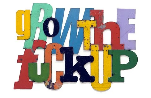
idea-obscura:

i’ve been thinking of doing this for a while now. after i saw this floating around, i wanted to make my own version to hang on my wall. and knowing me, well, i had to make it all ~shnazzy~ so i made this 11x17 poster. i made it so you…

idea-obscura:

i’ve been thinking of doing this for a while now. after i saw this floating around, i wanted to make my own version to hang on my wall. and knowing me, well, i had to make it all ~shnazzy~ so i made this 11x17 poster. i made it so you can download yourself one too, if you like. it’s a nice PDF file so you can take that to Kinko’s and blow it up and hang it nicely in your room or whateva.