Personal website of Art Blanc

Blog

This is where I write for the web.

Posts tagged Typography
Effects of Typography on Reader Mood and Productivity

In their paper titled The Aesthetics of Reading, Kevin Larson and Rosalind Picard present their findings on the effects of typography on reader mood and cognitive performance. They conducted two studies, each involving 20 people. The participants were divided into two groups of 10 and were given 20 minutes to read a specially typeset issue of The New Yorker on a tablet device. One of the groups got a badly typeset version (using Courier, with spaced out words), the other a properly typeset one.

Interesting findings. Bottom line: typography matters.

Art BlancTypography, research, Insight

amberbethanydesign:

Rory Bradley

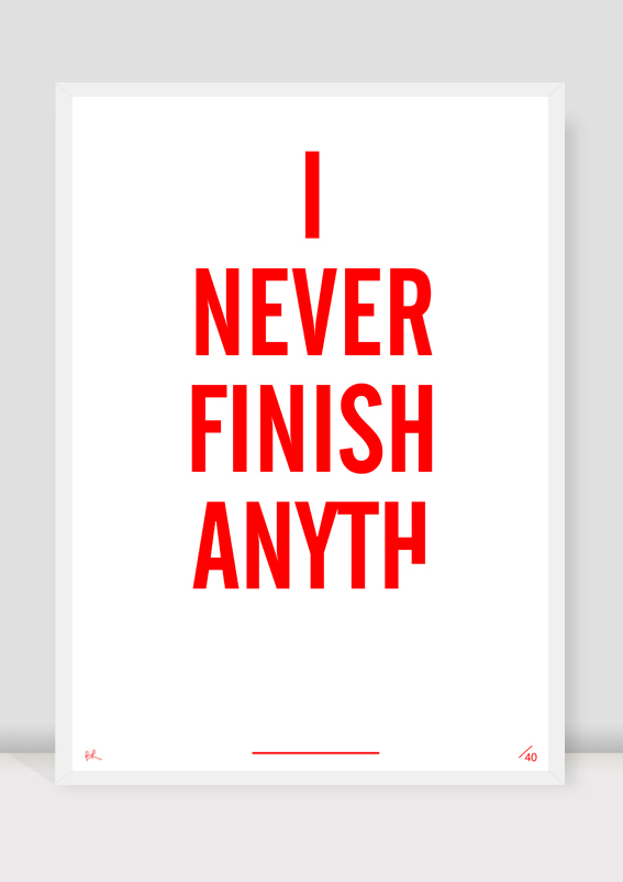
These posters are by a soon to be graduate in Dublin, Ireland. When i came across these images they jumped out at me and kind of reminded me of what i was trying to imply through my Waitress design. The use of “x” and the tick symbol are again ways of disregarding words giving them a negative appearance, i however showed negative and positive through negative and positive space.

The first image also caught my eye for the obvious reason that hands are being used to form type, its a really interesting concept and could link into the idea of individuality and personal aspects.

More images can be found at http://www.typographicposters.com/rory-bradley/

What’s not to love.

Art BlancTypography, poster
Typography Must Honor Content

Bringhurst uses a similar metaphor here that describes this work very well in saying that “typography is to literature as musical performance is to composition: an essential act of interpretation, full of endless opportunities for insight or obtuseness”

The use of “lorem ipsum” is really not helping at all during design process, better use a rough draft of content, and most importantly the content structure must be present from the beginning of the design process. It will function as the inner structure, without it we risk ourselves to waste countless hours to rework the design to fit the content, we were forced making compromise for vital design decision and ultimately hurt the overall design by making a sub-par work.

Typography must honor content, but in order to honoring it, the content must present. It’s a simultaneous and collaborative process, it’s not just about pushing pixel, choosing color palette, or choosing typeface.

Favorite Typefaces of 2011 by Typographica

Inspiring as always.

The idea is simple: I invite a group of writers, educators, type makers and type users to look back at 2011 and pick the release that excited them most. The reviews range from the academic (like Paul van der Laan on Zizou or Jens Kutilek on FB Alix) to the theoretical (such as Jan Middendorp on Agile) to the personal (like Carolina de Bartolo who reviewed Calibre and Periódico after firsthand experience with a redesign of WIRED magazine) to the playfully unexpected (Microsoft’s Si Daniels praises Apple Color Emoji) to the exclamatory (Matthew Butterick on Neue Haas Grotesk).